FDA's fair balance requirements come from 21 CFR 202.1, and they ask for two things at once. A prescription drug advertisement must present a summary of true information on side effects and contraindications that is fairly balanced against the effectiveness claims, and it must present that risk information with a prominence and readability reasonably comparable with how the benefit is presented. The second half is the one arguments are about, because prominence is physical: type, layout, contrast, headlines, white space. MLR Review Automation is Botminds' agentic software for promotional review, and its fair balance checker reads those physical properties off the piece and hands a reviewer numbers instead of an impression.
The worked readings here are sample data on a fictional brand from the solution. Every rule is quoted from the current eCFR text or from FDA guidance, linked where it appears.
What is fair balance in pharmaceutical advertising?
Fair balance is the requirement that an advertisement's treatment of a drug's risks be commensurate with its treatment of the drug's benefits — in how much it says, and in how visibly it says it. It is not a separate obligation bolted on to truthfulness. It is part of the statutory "true statement" test: an advertisement that is not fairly balanced does not present a true statement of information, whatever else it contains.
Three misconceptions do most of the damage in review meetings. The first is that fair balance is a word count — it is not, and no regulation names a ratio. The second is that a full safety page at the back cures an unbalanced front — it does not, and the regulation says so explicitly. The third is that an accurate piece is a balanced one — also no, because the test is about the impression the whole piece creates rather than the truth of each sentence in it.
What makes the requirement workable is that FDA named the factors it looks at, and they are all things you can see and measure on the page. That is the opening this guide is built on: a reviewer who has to tell a brand team that a layout fails can bring readings rather than a feeling.
The words the regulation actually uses
Two clauses of 21 CFR 202.1(e) carry the requirement, and they do different work. The fair balance clause, at (e)(5)(ii), is about scope and depth: an advertisement fails the true-statement test where effectiveness information "is presented in greater scope, depth, or detail than is required by section 502(n) of the act and this information is not fairly balanced by a presentation of a summary of true information relating to side effects and contraindications of the drug". It then adds a proviso that is a genuine safe harbour: no advertisement is in violation "if the presentation of true information relating to side effects and contraindications is comparable in depth and detail with the claims for effectiveness or safety".
The prominence clause, at (e)(7)(viii), is about presentation — and it is the one that names the factors.
Fails to present information relating to side effects and contraindications with a prominence and readability reasonably comparable with the presentation of information relating to effectiveness of the drug, taking into account all implementing factors such as typography, layout, contrast, headlines, paragraphing, white space, and any other techniques apt to achieve emphasis.
21 CFR 202.1(e)(7)(viii), advertisements that may be false, lacking in fair balance, or otherwise misleading
Read that list again, because it is the whole argument of this page. Typography. Layout. Contrast. Headlines. Paragraphing. White space. Every one is an attribute of a rendered page that can be read off it, by a person with a ruler or by software. The standard — "reasonably comparable" — is a judgement, but the inputs to the judgement are not.
A third clause closes the obvious escape route. Under (e)(3)(i), the true-statement requirement "applies to the entire advertisement", and "untrue or misleading information in any part of the advertisement will not be corrected by the inclusion in another distinct part of the advertisement of a brief statement containing true information relating to side effects, contraindications, and effectiveness of the drug". A balanced back page does not fix an unbalanced front one.
How is fair balance measured? Six readings a reviewer can argue with
No regulator publishes a formula, so any number you use is your own. That is not a reason to avoid numbers; it is a reason to be exact about what each one is evidence of. Six readings cover the factors the regulation names, and each rests on a specific rule or guidance sentence rather than on taste.
Six readings MLR Review Automation takes, and what each one is evidence of
| The reading | What it is evidence of | What it rests on |
|---|---|---|
| Share of words given to risk, against benefit | Scope and depth — the first half of the fair balance test. Not a legal ratio, but the quickest signal that risk has been compressed. | 21 CFR 202.1(e)(5)(ii): effectiveness presented in greater scope, depth or detail, not fairly balanced by a summary of true risk information. |
| Risk type size against the benefit headline | Typography, named in the prominence clause. A 22-point benefit headline above 8-point risk text is a typical finding on a detail aid. | 21 CFR 202.1(e)(7)(viii): typography, among the implementing factors. |
| Contrast of risk text against its background, compared with benefit text | Whether the layout makes benefit easier to read than risk. The draft guidance addresses this directly. | FDA draft guidance on presenting risk information: contrast between text and background should not highlight the benefit information more than the risk information. |
| Where risk falls in the reading order | Layout and white space — whether risk appears where the benefits do, or is held back to a separate part of the piece. | FDA draft guidance: to be comparably prominent, risk information should generally appear in the same parts of the piece as the benefits. |
| Whether a signal precedes the risk | Headlines and paragraphing: a heading or a lead-in that tells a reader risk information is starting, rather than letting it run on from the claims. | 21 CFR 202.1(e)(7)(viii): headlines and paragraphing, among the implementing factors. |
| For audio, words a second and the dual presentation | Pacing in broadcast. Treat this one as a house measure, not a legal test: the regulation asks about volume, articulation and pacing and requires text alongside the audio on television. | 21 CFR 202.1(e)(1)(ii)(B) and (C). |
Note what is missing from that table: a verdict column. Each reading is an input. The checker in the solution states its own limit in those terms — it reports measurements and never passes or fails a piece on its own — and the reason is not modesty. It is that the legal standard is about net impression, and a net impression is not the sum of six numbers.
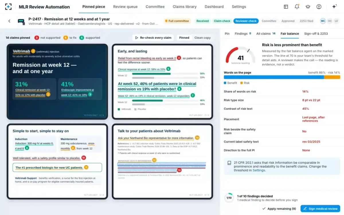
The fair balance reading in MLR Review Automation, risk against benefit
Prominence is not type size alone
Type size is the easiest factor to measure and the easiest to satisfy while still failing. A piece can set risk text at the same point size as the body copy and remain lopsided, because the benefit is not carried by the body copy — it is carried by a headline, a photograph, a chart and a colour field, none of which the risk text competes with.
FDA's own footnote in the CFL guidance makes the comparative nature of the test explicit: in evaluating whether information is presented clearly and prominently, FDA "considers the conspicuousness of the information as compared to other statements and presentations in the communication (including factors such as location, font size, contrast, and white space) and also considers whether it is presented in a way that is likely to be read and understood by those receiving the communication". Two halves there, and the second is the one spreadsheet-driven reviews forget: likely to be read and understood. Dense, unparagraphed, jargon-heavy risk text at the correct point size is still a failure of readability, which the regulation names alongside prominence.
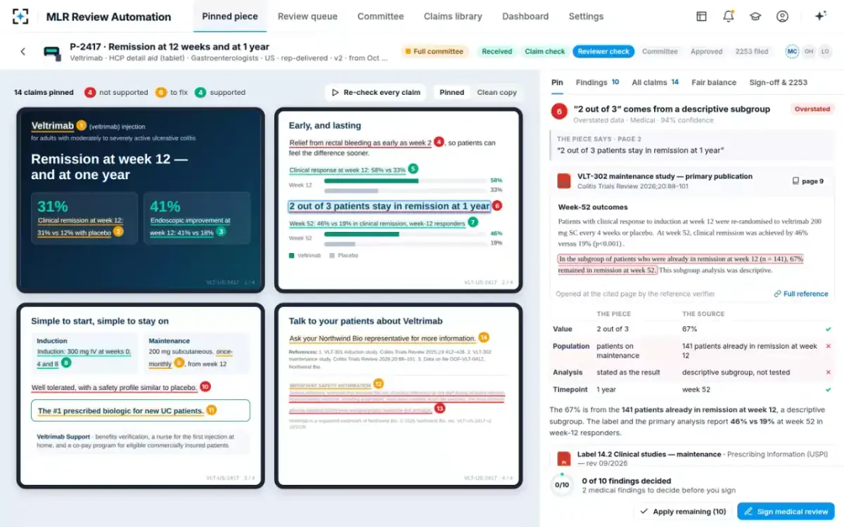
The piece the readings are taken from, claim by claim
Where risk information has to appear, and where it must not
Placement does more work than any other factor, because it decides whether the risk is encountered at all. FDA's draft guidance states the principle plainly: risk information should be included in the main part of a piece, and "to be comparably prominent to benefit information, risk information should generally appear in the same parts of the piece as the benefits". The same section adds the contrast rule: "contrast between text and background should not highlight the benefit information more than the risk information."
The same claim, laid out two ways
The layout that generates findings: On the last panel, after the references and below the logo, in a block a reader reaches only if they turn the page.
The layout that survives: Under the claims it qualifies, in the same part of the piece as the benefits.
The layout that generates findings: 8 point risk text under a 22 point benefit headline — little more than a third of the size, in a different weight.
The layout that survives: Risk set at the body size of the claims, in the same weight and family.
The layout that generates findings: Grey risk text on a pale tint, against claims in solid ink on white.
The layout that survives: Full contrast, matching the claims; nothing about the fill makes risk harder to read.
The layout that generates findings: The risk block runs on from the references with no heading, so nothing tells the reader it has started.
The layout that survives: A heading and a lead-in, so paragraphing and headlines work for the risk rather than against it.
The layout that generates findings: No direction to the full prescribing information anywhere on the panel.
The layout that survives: A clear direction to the full prescribing information where the risk text ends.
Can a piece be misleading if every sentence in it is true?
Yes, and this is the single most important thing to understand about how FDA reads promotional material. The agency's draft guidance on presenting risk information states it directly.
It is important to emphasize that when FDA evaluates the risk communication in a promotional piece, FDA looks not just at specific risk-related statements, but at the net impression — i.e., the message communicated by all elements of the piece as a whole. … A promotional communication that conveys a deceptive net impression of the product could be misleading, even if specific individual claims or presentations are not misleading.
FDA, Presenting Risk Information in Prescription Drug and Medical Device Promotion — draft guidance, May 2009 (distributed for comment purposes only; not for implementation)
Two practical consequences follow for a review team. First, a claim-by-claim check, however rigorous, cannot by itself clear a piece. Every claim can be supported at its page and the assembled piece can still fail. Someone has to look at the whole thing and ask what a prescriber would come away believing. Second — and this is the half that gets lost — the net impression test cuts both ways. It is also why six readings cannot be turned into a pass mark. A score of 72 against a threshold of 70 is not permission; it is an argument that the layout is defensible, which a reviewer may accept or reject.
The useful division of labour falls out of this. Measurements are for the parts of the test that are physical and comparative. The verdict belongs to the person who signs, which is also what their signature commits them to.
Broadcast: the major statement, clear, conspicuous and neutral
Television and radio are the one place where prominence stopped being a general standard and became a list. For prescription drug advertisements presented directly to consumers in those formats, 21 CFR 202.1(e)(1)(ii) requires the major statement — the statement of the product's major side effects and contraindications — to be presented in a clear, conspicuous and neutral manner, and then defines that term with five conditions.
The five conditions a television major statement must meet (21 CFR 202.1(e)(1)(ii))
- Consumer-friendly language that is readily understandable
The regulation asks for language and terminology a consumer can follow, which rules out reciting the labelling verbatim at speed.
- Audio at least as understandable as the rest of the advertisement
Judged on volume, articulation and pacing — so the major statement cannot be read faster or more quietly than the benefit copy around it.
- On television, audio and text together — dual modality
The text must display either the verbatim key terms or phrases from the corresponding audio, or the verbatim complete transcript.
- Text displayed long enough to be read easily
The regulation treats the duration as sufficient if the text begins at the same time and ends at approximately the same time as the corresponding audio.
- Nothing competing for the viewer’s attention
During the major statement the advertisement must not include audio or visual elements, alone or in combination, that are likely to interfere with comprehension of it.
This is why broadcast deserves its own lane in any routing rule. A print finding is usually a layout change; a broadcast finding can be a re-edit, a re-record or a re-shoot, and the fifth condition in particular — no competing audio or visual elements during the major statement — is a creative constraint rather than a copy constraint. In the sample settings here, broadcast always goes to the full committee regardless of score, which is one fictional team's rule and a sensible one.
What FDA cited when it said a piece was not fairly balanced
The clearest picture of how the standard is applied comes from FDA's own enforcement letters, which quote the regulation back at the piece. In a letter of 13 March 2026 to ImmunityBio, Inc. concerning ANKTIVA, the Office of Prescription Drug Promotion wrote that the television advertisement and podcast at issue "are misleading because they fail to present information relating to warnings and precautions and side effects associated with the drug with a prominence and readability reasonably comparable with the presentation of information relating to the benefits of the drug".
Three things are worth noticing about that sentence. It tracks the regulation almost word for word, so the standard being applied is the one on the page rather than an unwritten house view. It applies the same test to a podcast as to a television spot, which is a reminder that new channels do not come with new rules. And it is about presentation — the letter's separate findings about the pieces' efficacy claims are a different failure. A piece can fail fair balance while every efficacy claim in it is supportable, and the findings FDA keeps coming back to sets out how the categories relate.
How often pieces fall short, when somebody counts
Enforcement letters tell you what FDA noticed; they do not tell you how common a shortfall is. For that you need somebody to audit a sample without regard to whether it was challenged, and one widely cited published attempt looked at physician-directed print advertisements in American biomedical journals.
Adherence in 83 physician-directed journal advertisements
The study is fifteen years old and sampled one month, so it is evidence about a practice rather than a current rate. Two of its findings have aged well as diagnostics, though. "Did not quantify serious risks" describes a failure mode that survives every house standard based on word counts: a piece can give risk plenty of column inches while describing the serious ones only qualitatively. And "lacked verifiable references" is the same defect this whole discipline rests on — a claim whose source cannot be opened at a page is a claim nobody has checked, which is the stage that eats most of a review's days.
Setting a threshold your reviewers will defend
If you are going to put a number on fair balance, three rules keep it honest. Say whose number it is. Keep it visible on every reading, so nobody mistakes it for a legal line. And let it differ by channel, because a banner and a detail aid cannot reasonably be held to the same geometry.
One reading on the fictional sample detail aid, against a threshold the team chose
41
the fair balance reading on the marked-up version, against the team’s threshold of 70
14%
of the piece’s words given to risk
8 pt
risk text, under a 22 pt benefit headline
45%
contrast on the risk block, against full contrast on the claims
What a threshold is for is triage, not adjudication. A reading of 41 against 70 does not mean the piece is unlawful; it means the gap between risk and benefit presentation is wide enough that a reviewer should look, and it tells them exactly where to look — placement and type size, on this piece, rather than word share. A reading of 68 against 70 means almost nothing on its own, and a review system that treats those two cases the same has turned a triage tool into a rubber stamp in one direction and a blocker in the other.
One more discipline is worth building in. Record which findings reviewers overrule. If your threshold produces a steady stream of dismissals with reasons that all say the same thing, the threshold is wrong for that channel, and the evidence to fix it is already in the file. That is the same loop that makes a pilot worth measuring: the readings are only useful if the settings behind them keep moving toward what your reviewers actually defend.
Questions people ask
Is fair balance about word count?
No. The regulation speaks of scope, depth and detail, and separately of prominence and readability; it names no ratio and no word count. Share of words is a useful first reading because it is quick and it correlates with compression of the risk information, but it is evidence rather than a test. A piece can give risk a third of its words and still fail on type size and placement, and a piece with a modest word share can be perfectly balanced if the risk is set where the benefits are, at comparable size and contrast.
Does risk information have to be the same size as benefit information?
The regulation asks for a prominence and readability reasonably comparable with the presentation of effectiveness, taking account of typography, layout, contrast, headlines, paragraphing and white space — so size is one factor among several rather than a standalone requirement. In practice a large gap in type size is the hardest finding to defend, because it is the most visible and the easiest for a regulator to describe. The question a reviewer should ask is not whether the sizes match but whether a reader encountering the piece normally would find the risk as readable as the claim it qualifies.
What does clear, conspicuous and neutral mean?
It is a defined term for broadcast. Under 21 CFR 202.1(e)(1)(ii), a major statement in a television or radio advertisement is presented in a clear, conspicuous and neutral manner if it meets five conditions: consumer-friendly, readily understandable language; audio at least as understandable as the rest of the advertisement in volume, articulation and pacing; on television, concurrent audio and text; text displayed long enough to be read easily; and no audio or visual elements during the statement likely to interfere with comprehension of it. The term does not apply to print.
What is the major statement in a drug advertisement?
In broadcast advertising, the major statement is the presentation of the product's major side effects and contraindications, which a consumer-directed television or radio advertisement must carry. It is the broadcast counterpart of the risk presentation that a print piece carries alongside its claims, and it is what the clear, conspicuous and neutral standard attaches to. A separate question — how the audience is pointed to the full prescribing information — is handled by the adequate provision arrangements a broadcast piece also has to make.
Where does risk information have to appear on a page?
In the same parts of the piece as the benefits, as a general matter. FDA's draft guidance on presenting risk information states that risk should be included in the main part of a piece, and that to be comparably prominent it should generally appear where the benefits do. The structural rule behind that sits in the regulation itself: the true-statement requirement applies to the entire advertisement, and misleading information in one part is not corrected by true information in another distinct part. A back page is therefore an addition to a balanced piece, never a substitute for one.
Can software decide whether a piece is fairly balanced?
No, and a system that claims to is selling you a liability. Software can read the physical factors the regulation names — type size, contrast, placement, share of words, pacing — far more consistently than a person can, and that is genuinely useful, because those readings are what turns a reviewer's instinct into an argument a brand team can engage with. What software cannot do is judge net impression, which is the actual legal standard and is about what a reader comes away believing. In this solution the checker reports measurements and never passes or fails a piece on its own.