Dark patterns in banking are interface designs that push customers toward choices they would not otherwise make and that may harm them: a fee that appears only after commitment, a paid option chosen by default, a "free" headline that the fee screen contradicts, an exit far harder than the entry. No federal rule names them, but the unfair, deceptive and abusive standards reach every one, and the FTC has catalogued them in detail. They are hard to catch because they live in the journey, not in any one document: the agreement can be accurate and the screen still misleading. Botminds' UDAAP Risk Assessment exists for that review. Its agents walk a bank's or a fintech partner's app as a customer would, from the ad to closing the account and making a complaint, count the taps in and out, and pin each risk on the exact screen, while a compliance officer decides each one.
Why the exit and the defaults deserve a review of their own
2×
sign-ups for a dubious identity theft product when dark patterns were used
Study cited by the FTC staff, 2022
15%
of checking account complaints the FDIC investigated in 2025 were about account closure
Account block: a further 12%
3 taps
to open the sample account; leaving takes 4 taps and a weekday phone call
Fictional sample journey
What are dark patterns in banking?
The FTC's staff report of 2022 uses the term "to describe design practices that trick or manipulate users into making choices they would not otherwise have made and that may cause harm" (FTC, Bringing Dark Patterns to Light). In a bank or fintech app they cluster where money or consent is at stake: the fee disclosure, transfer options, overdraft opt-in, and the path out of the account.
The report also explains why phones matter: "Studies show that some dark patterns are more common in mobile apps than on websites," and "Many companies, for instance, are able to hide important information from consumers on their mobile devices because the amount of scrolling required makes it unlikely that people will see it." Most bank and fintech accounts are now opened and managed on a phone, which is why a review of a desktop screenshot can pass a journey a customer experiences very differently.
Are dark patterns illegal for banks?
Not as a category; as conduct, often. There is no federal ban on "dark patterns" by name, but a design that misleads is tested as deceptive, one that imposes avoidable-only-in-theory costs as unfair, and one that exploits a customer's inability to protect their interests as abusive. The FTC cannot bring those cases against banks, but the prudential regulators apply the same section 5 standards, and Dodd-Frank adds abusive. The CFPB's examination procedures, still in its November 2025 manual, flag one design directly as an area for transaction testing: whether "Penalties are imposed on a customer when he terminates his relationship with the entity" (CFPB Supervision and Examination Manual).
The CFPB's own circular on negative option marketing, issued in 2023, was among the 67 documents it withdrew on May 12, 2025 (90 FR 20084). The examination findings that preceded the change are a better guide in any case, because they describe practices rather than policy.
Four kinds of dark pattern, and where each shows up in a banking app
The FTC report groups dark patterns into four families: design elements that induce false beliefs, that hide or delay disclosure of material information, that lead to unauthorized charges, and that obscure or subvert privacy choices. The first three map directly onto the screens a UDAAP review walks.
The FTC's dark pattern families, mapped to banking screens and the UDAAP standard each raises
| FTC family | On a banking or fintech screen | Standard usually raised |
|---|---|---|
| Induce false beliefs | A headline promising "always" or "free" that the agreement or fee schedule contradicts; a deposit-insurance claim with no bank named | Deceptive |
| Hide or delay material information | A fee first shown after the customer commits, or folded behind "See all fees"; a total that is never shown | Deceptive; unfair if the fee cannot reasonably be avoided |
| Lead to unauthorized charges | A paid option preselected; overdraft coverage or an add-on switched on by default | Unfair; abusive where it exploits inattention |
| Roadblocks to cancellation (an obstruction pattern) | Opening in the app, closing only by phone in business hours; a retention screen in the way | Abusive; deceptive if the agreement promises an easier exit |
| Obscure or subvert privacy choices | Data-sharing switches on by default | Privacy law first; UDAAP where the choice is misrepresented |
What is a roach motel dark pattern? Easy in, hard out
"Roach motel" is designers' slang for an account that is easy to get into and hard to get out of. The FTC's appendix calls it "Roadblocks to Cancellation": "Making it easy to sign up but hard to cancel, by requiring people to go through tedious, time-consuming cancellation procedures." Its examples include "letting people sign up online, but making them use another means to cancel" and requiring people to cancel by phone while "opening the line during limited hours." The report's guidance for subscription sellers is a useful test for any account: cancellation should be "at least as easy to use as the method the consumer used to buy the product or sign up for the service."
Bank customers notice. Account closure made up 15% of the checking account complaints the FDIC's consumer response unit investigated in 2025, and account blocks another 12% (FDIC Consumer Compliance Supervisory Highlights, March 2026).
Can a hard-to-close account be abusive?
Yes, and deceptive as well when the customer was told closing would be easy. In its last full supervisory report before the 2025 change, the CFPB found that "lenders engaged in deceptive acts and practices when they prevented paycheck advance product consumers from closing their loan accounts until they resolved pending debits, and continued debiting consumer deposit accounts, despite representations that accounts could be closed at any time" (CFPB Supervisory Highlights, Issue 37). The same conduct was found abusive, as taking unreasonable advantage of consumers' inability to protect their interests.
Take a sample journey as it runs through UDAAP Risk Assessment; the companies are fictional. Fernway's Early Pay account, offered through Tessaly Community Bank, opens in three taps, about a minute and forty seconds, at any hour. Version 3 replaced version 2's two-tap in-app close with a screen that reads "To close your account, call us Monday–Friday, 8 AM–6 PM ET", with no close button. The account agreement, at §12, says customers may close "in the Fernway app or by calling us"; the program agreement between bank and partner, at §8.1, says "Customers shall be able to close an account through each channel in which they may open one."
UDAAP Risk Assessment: three taps to join, a phone call to leave
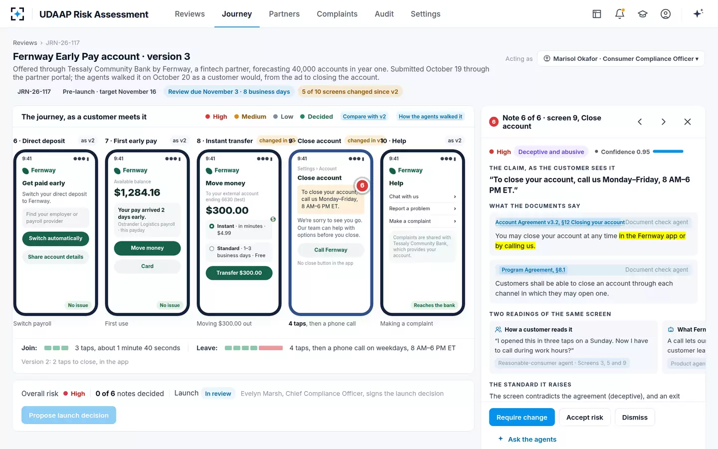
The comparison under the screens is the whole argument: what it takes to join against what it takes to leave.
The asymmetry a screenshot review never sees
Joining the sample account: The app
Leaving it, in version 3: The app, then a phone call
Joining the sample account: 3 taps
Leaving it, in version 3: 4 taps, then the call
Joining the sample account: Any hour, any day
Leaving it, in version 3: Weekdays, 8 AM to 6 PM ET
Joining the sample account: Opening in the app
Leaving it, in version 3: Closing in the app or by phone (agreement §12); every channel used to open (program agreement §8.1)
Are preselected options deceptive?
A preselected paid option is the FTC's "Preselection" pattern: "Preselecting a default that's good for the company, but not the user." Whether it breaks the law depends on the facts, but defaults have a record in banking. The CFPB found that core processors had set their platforms to go on charging overdraft and re-presentment fees by default until a client bank switched them off, and called that unfair (NSF representment fees and the core's default setting); overdraft and NSF fee refunds after its supervision reached nearly $250 million.
For overdraft, the law answers the default question directly. Regulation E lets a bank charge for paying ATM and one-time debit card overdrafts only if it "Obtains the consumer's affirmative consent, or opt-in" (12 CFR 1005.17). A consent box already ticked is hard to call affirmative. On the sample bank's complaint screen, six customers in 30 days said they did not know they had been opted in to overdraft coverage, all pointing to a screen where "Yes, cover me" was preselected; the review was reopened. On the Fernway journey the paid instant transfer, $4.99, was preselected over the free standard transfer, and the agents rated it abusive, Medium. The required change: "Choose nothing by default; list Standard (free) first."
"Preselecting a default that's good for the company, but not the user."
FTC staff report, Bringing Dark Patterns to Light, appendix A
What is drip pricing, and does it happen in bank apps?
Drip pricing advertises part of a price and reveals the rest late. The FTC describes firms that "advertise only part of a product's total price to lure in consumers, and do not mention other mandatory charges until late in the buying process", and cites a study in which users not shown fees upfront "ended up spending about 20% more money and were 14% more likely to complete" the purchase. Bank fees are rarely mandatory in the ticketing sense, but the bank version is familiar: a headline that says free, and a fee that appears two screens later.
On the sample journey, the landing screen promised "always free"; the $4.99 instant transfer fee first appeared on screen 4, folded inside "See all fees". The agents rated the headline deceptive, High, and the folded list deceptive, Low; the officer required a new headline and accepted the folded list only with a condition: keep "See all fees" above the Continue button and recheck after 90 days of complaints. Why a disclosed fee can still fail is the subject of the UDAAP 3 part test.
How do you review a banking app for dark patterns?
Walk it as a customer, on a phone, all the way out. Most reviews receive a deck of the happy path: the ad, the sign-up, the welcome screen. The patterns above sit off that path: in fee lists, options, consent screens, the close flow and the complaint form. The OCC's handbook adds one more exit to check: whether automated or virtual assistants "easily or clearly allow customers to speak with a human representative of the bank when questions and billing inquiries are unanswered" (OCC Comptroller's Handbook, UDAP and UDAAP).
A screen-by-screen dark pattern review for a banking or fintech app
- Walk the whole journey at phone size
Ad, landing, sign-up, fee disclosure, first use, a transfer, closing the account and making a complaint. Capture every screen, by version.
- Count taps in and taps out
If leaving takes a different channel or more steps than joining, record it and check the agreement and any program agreement.
- Find where each fee first appears
Note the screen and whether the customer has already committed. A fee behind a fold or a link is a disclosure question; one after commitment is an avoidability question.
- List every default
Preselected transfer speeds, overdraft coverage, add-ons, tips, data sharing. Ask what a customer pays if they accept every default.
- Read absolute words against the documents
"Always", "free", "guaranteed", "FDIC insured": each needs a passage that supports it, or it is a risk.
- Check who the customer thinks the bank is
A deposit-insurance claim must not mislead about which institution holds the money.
- Try to reach a person
From the app's help and chat, as the OCC handbook expects.
The deposit-insurance item has its own rule. Under the FDIC's Part 328, a statement about deposit insurance can violate the rule if a material part of it could mislead a reasonable consumer, whether or not anyone was in fact misled (12 CFR 328.102(b)(3); the not FDIC insured disclosure guide quotes the rule). On the sample journey the ad said "FDIC insured" after version 3 dropped the bank's name; the note was rated deceptive, Medium. Partner screens raise this question most often, which is why third-party products get a guide of their own.
Where UDAAP Risk Assessment fits in an app review, and where it does not
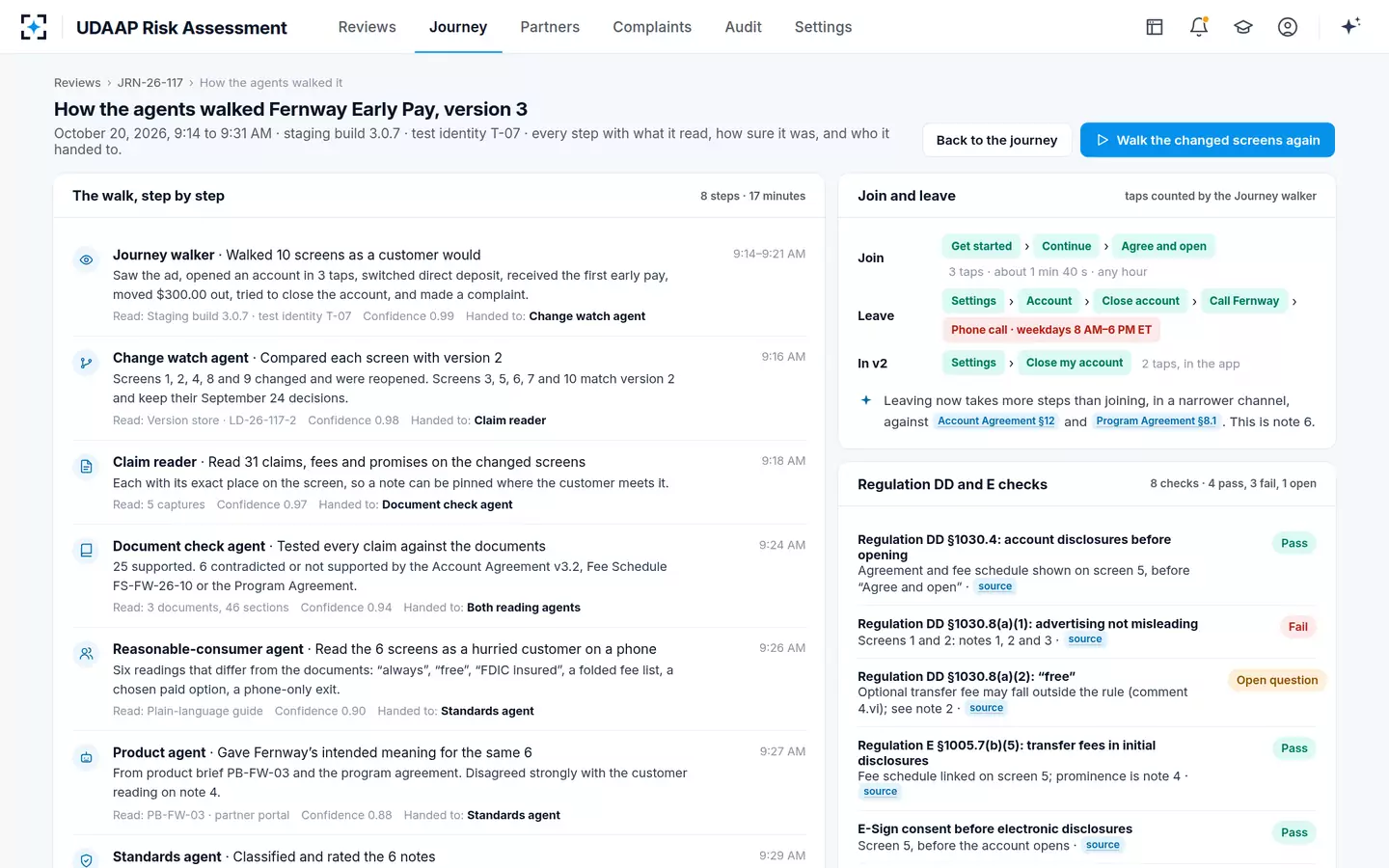
The solution's Journey walker opens the partner's or the bank's staging build with a test identity, never a real customer, and walks every screen including closing and complaining, counting taps both ways. The Claim reader lists every claim, fee, default and disclaimer with its place on the screen; the Document check agent tests each against the agreement, the fee schedule and the program agreement, citing the clause or saying "no source". The Reasonable-consumer agent reads each screen once, in order, at phone size, and says what a hurried customer takes away. On the sample journey the walk of ten screens took 17 minutes.
How the agents walked the journey, with taps to join against taps to leave
It does not judge visual design taste, test accessibility or replace usability research, and it does not decide that a pattern is unlawful. The Standards agent proposes a classification and wording, and makes no call below 0.80 confidence or when its two readings disagree; the compliance officer decides with a reason code. To walk one of your own journeys out to the close button, start from UDAAP Risk Assessment.
Questions people ask
Did the CFPB issue guidance on dark patterns?
Not under that name for banks. Its 2023 circular on unlawful negative option marketing, which covered sign-up and cancellation designs, was withdrawn on May 12, 2025. Its supervisory findings, such as the 2025 report on blocked account closures, remain the clearest public examples.
Is a retention offer on the close screen a dark pattern?
It can be. The FTC's guidance for subscription sellers says customers should not be subjected to "new offers or similar attempts to save the account that impose unreasonable delays" on cancelling. One offer is not the problem; a path that makes leaving depend on declining several is.
Are dark patterns more common in mobile banking apps?
The FTC's staff report says studies show some dark patterns are more common in mobile apps than on websites, and that small screens make it easier to hide information below long scrolling. A review done on desktop screenshots can miss both.
Is a pre-ticked overdraft box allowed?
Regulation E allows overdraft fees on ATM and one-time debit card transactions only after the customer's affirmative consent, given after a segregated notice. A box ticked by the bank does not show the customer chose anything, which is why consent screens belong in every journey review.
Who is responsible when a fintech partner's app uses a dark pattern?
The bank, for products offered through it. The OCC's handbook treats a third party's conduct on the bank's behalf as the bank's responsibility, and the FDIC's procedures say the same of third-party marketing, which is why partner journeys need the same walk as the bank's own.